KK
KK Eclat
Brand Identity
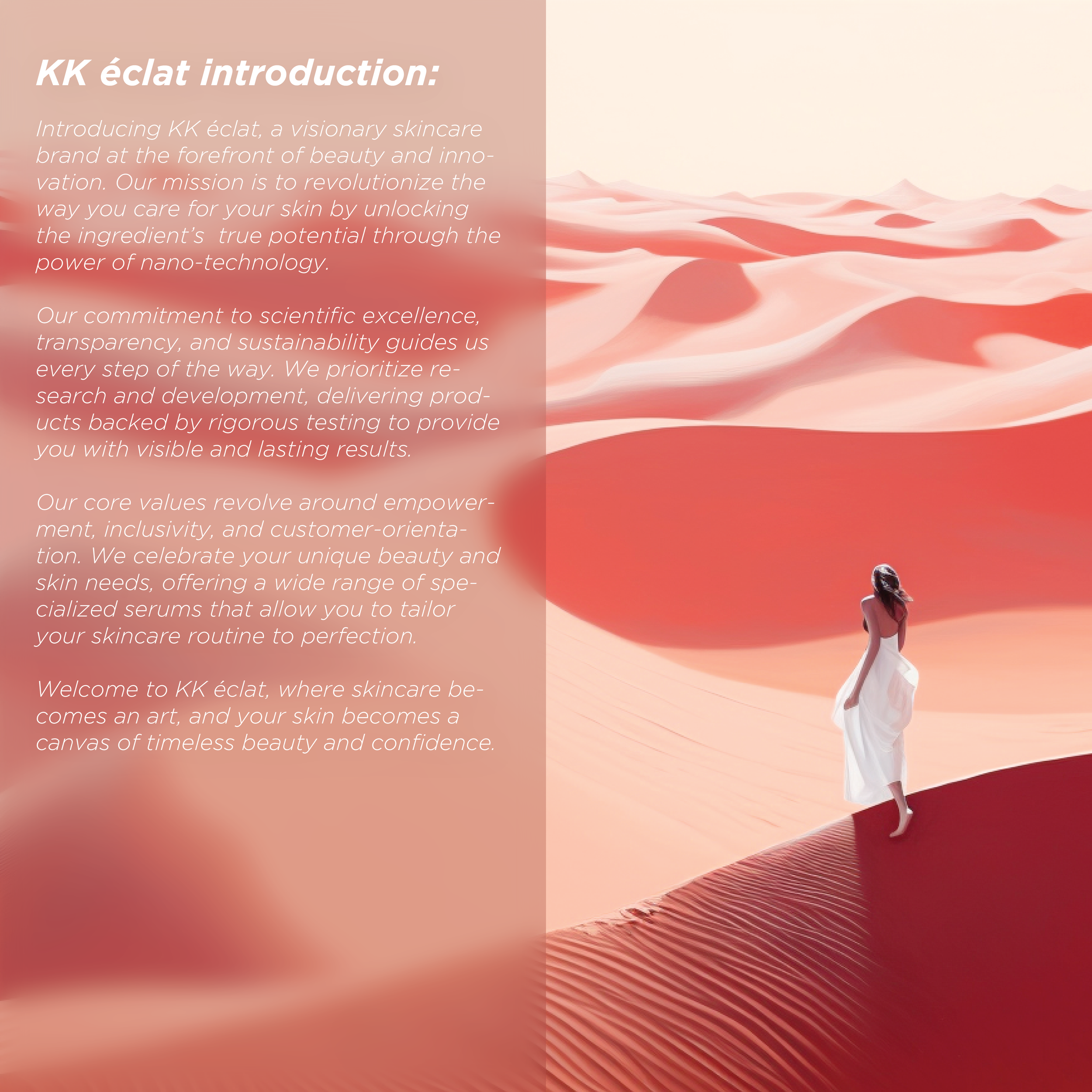
KK éclat, a visionary skincare brand at the forefront of beauty and innovation.
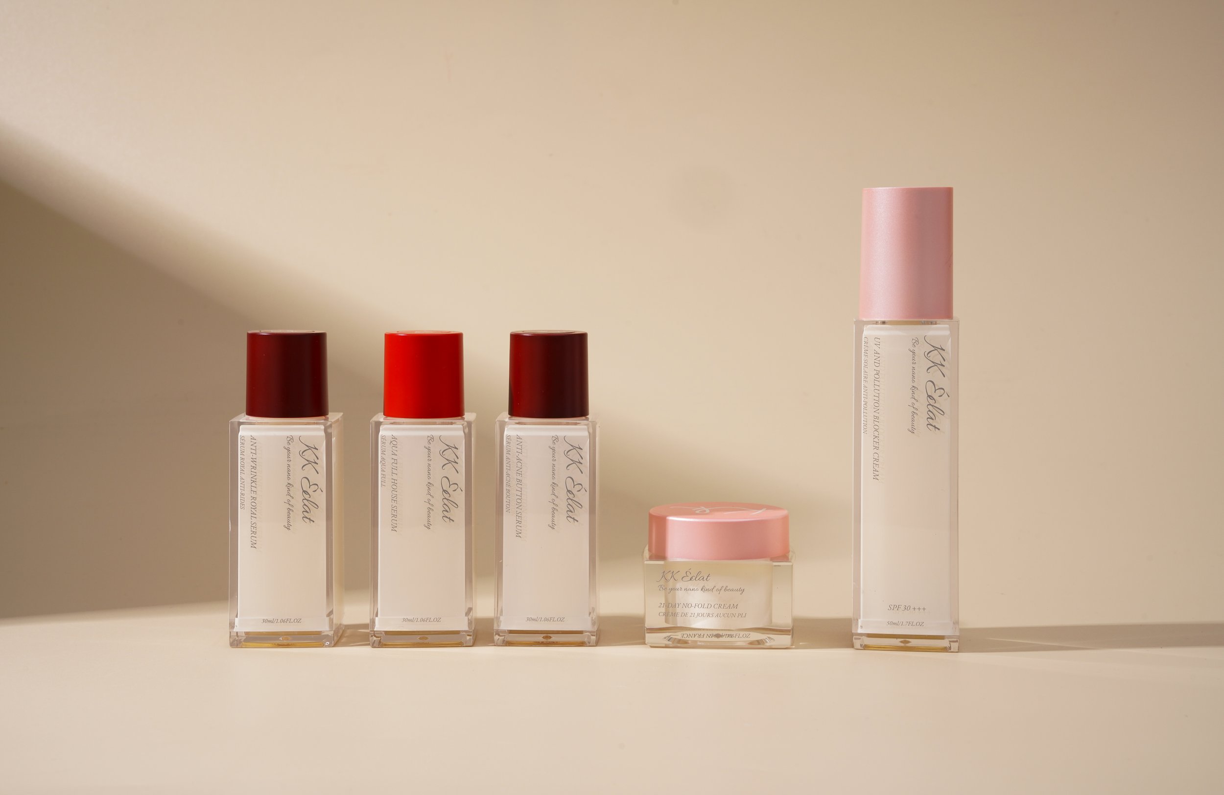
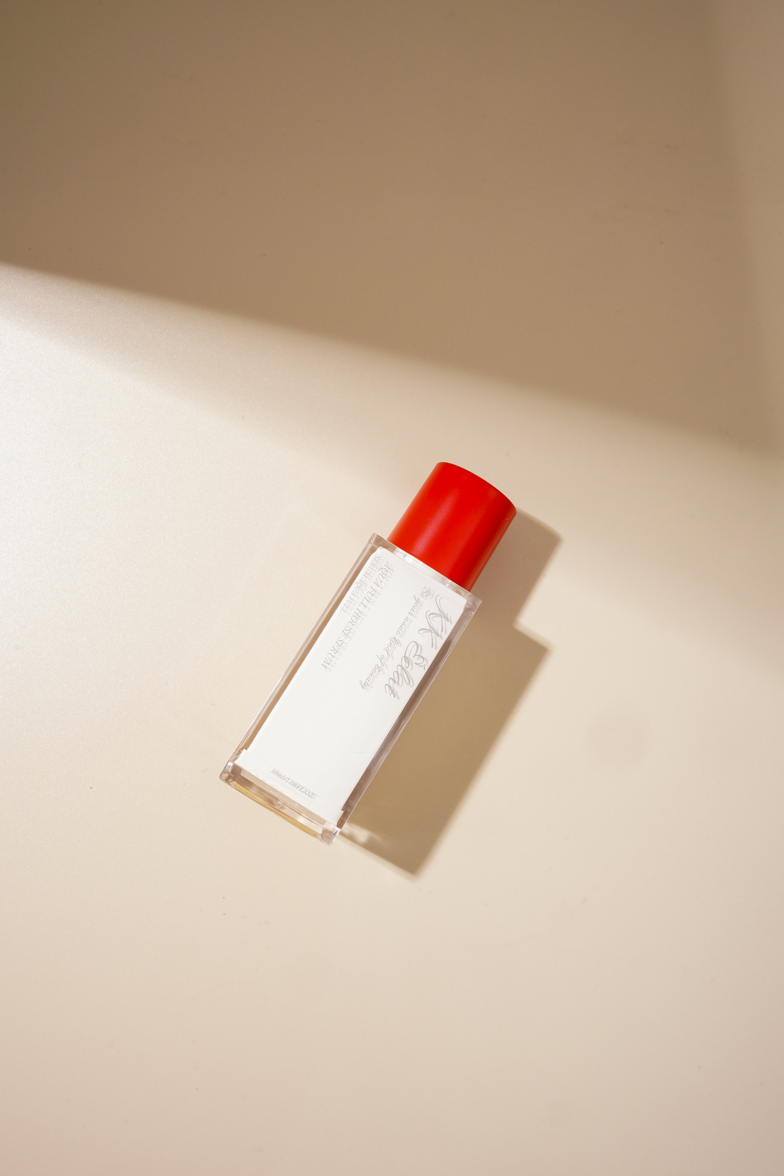
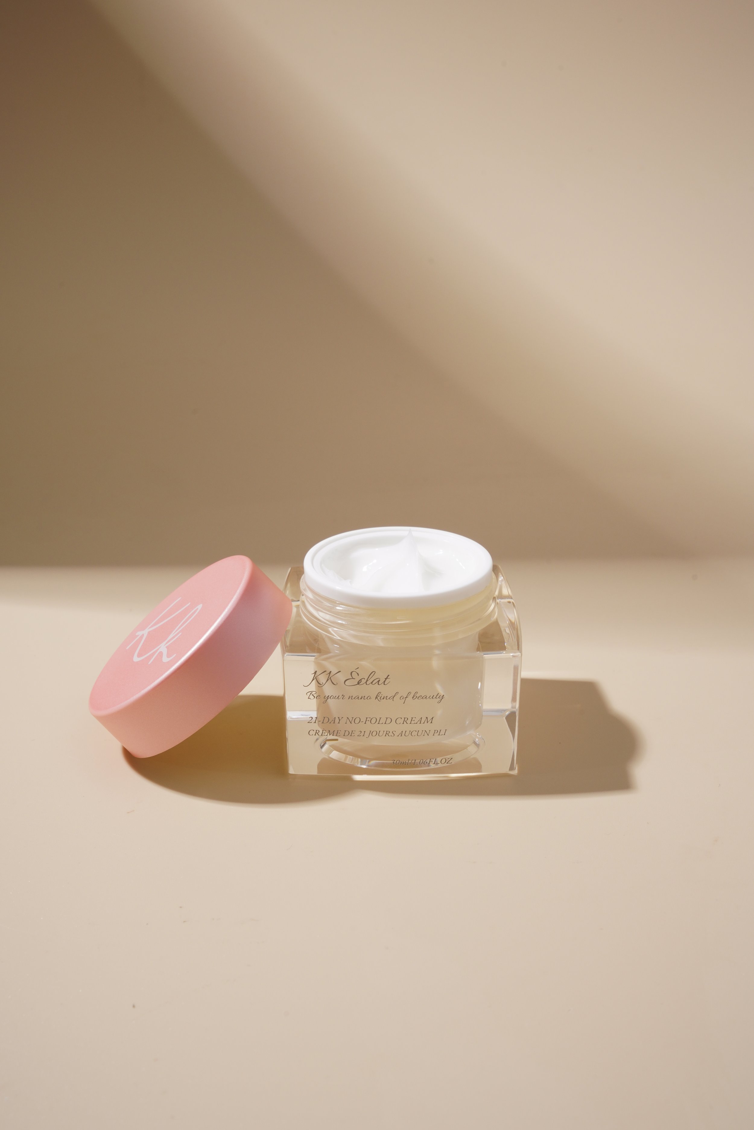
The products are presented as premium, with a visual identity that includes a clean, sophisticated aesthetic with a minimalist design. The visual identity reflected the use of natural motifs, earthy colors, and recycled materials in its packaging design. Combining natural elements and earth tone visuals, KK éclat presents itself with a special visual unique to itself.
COLOR
•
PALLETE
•
COLOR • PALLETE •
The natural colors symbolize the brand's commitment to transparency, grounding its innovative skincare solutions in the purity and simplicity of nature. While the earth tone calls back to the products’ look.
MOOD
•
BOARD
•
MOOD • BOARD •
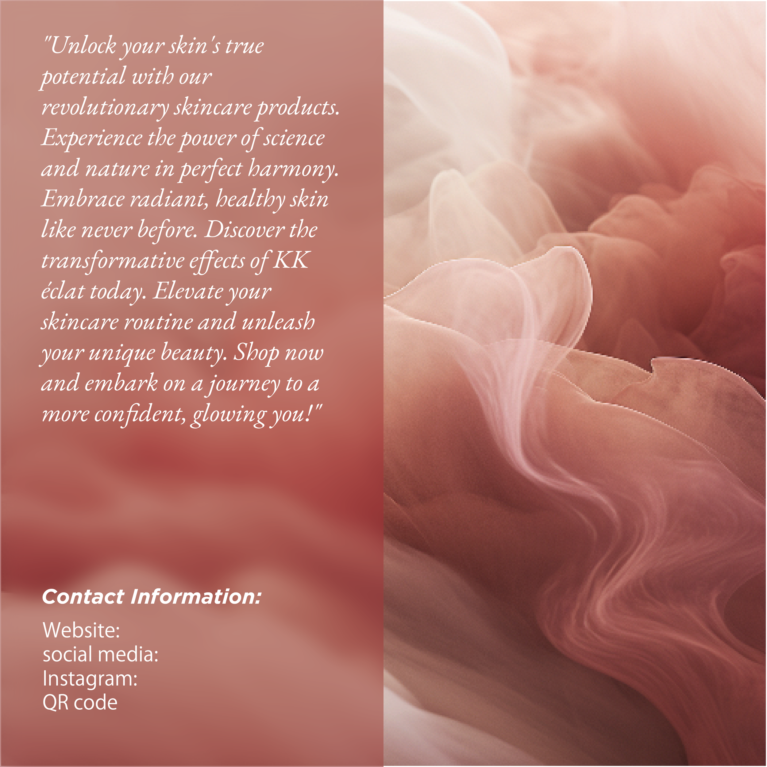
The elegant and minimalistic look resonates with the brand's values of natural beauty and purity
PRODUCT
•
SHOTS
•
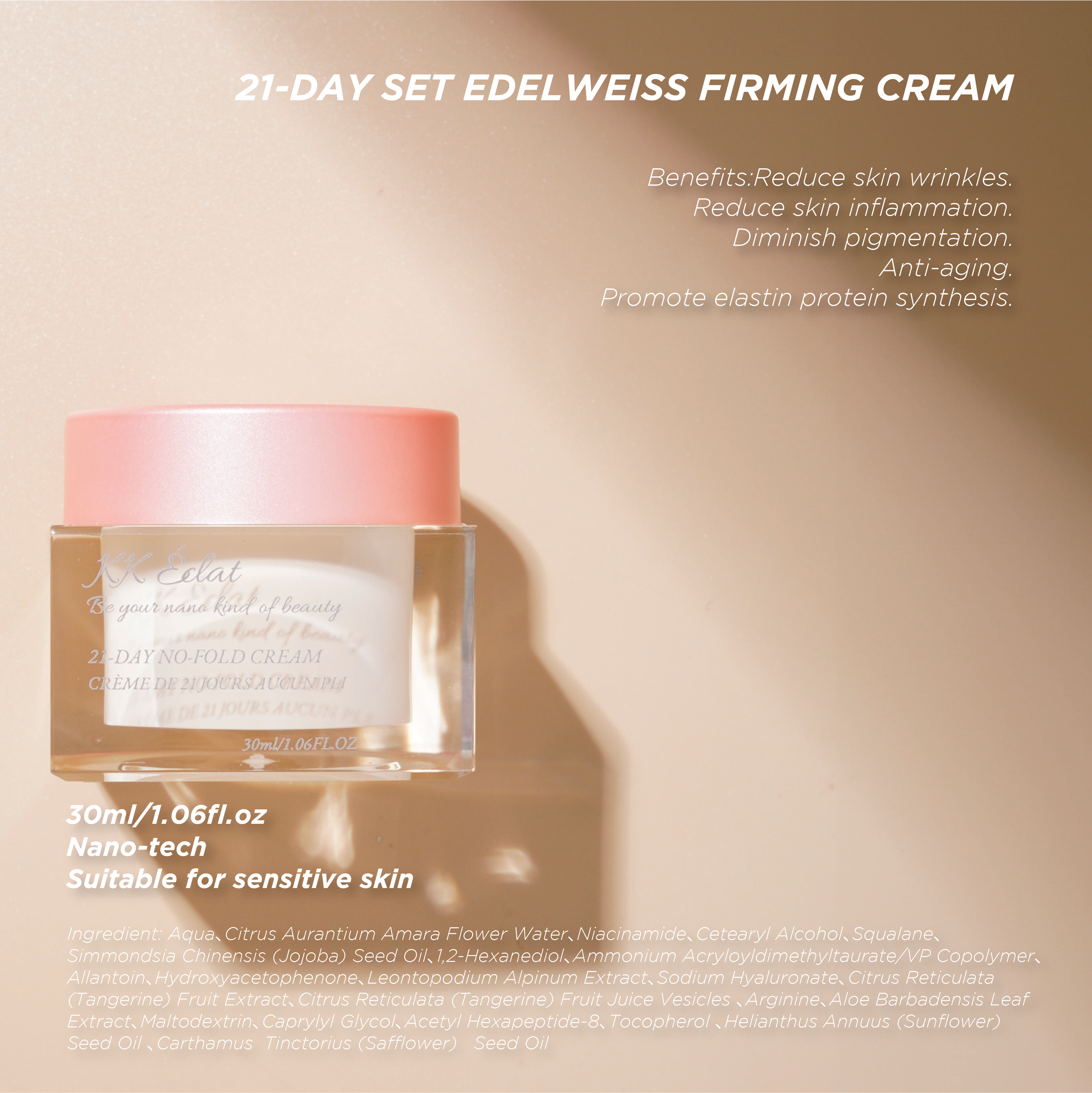
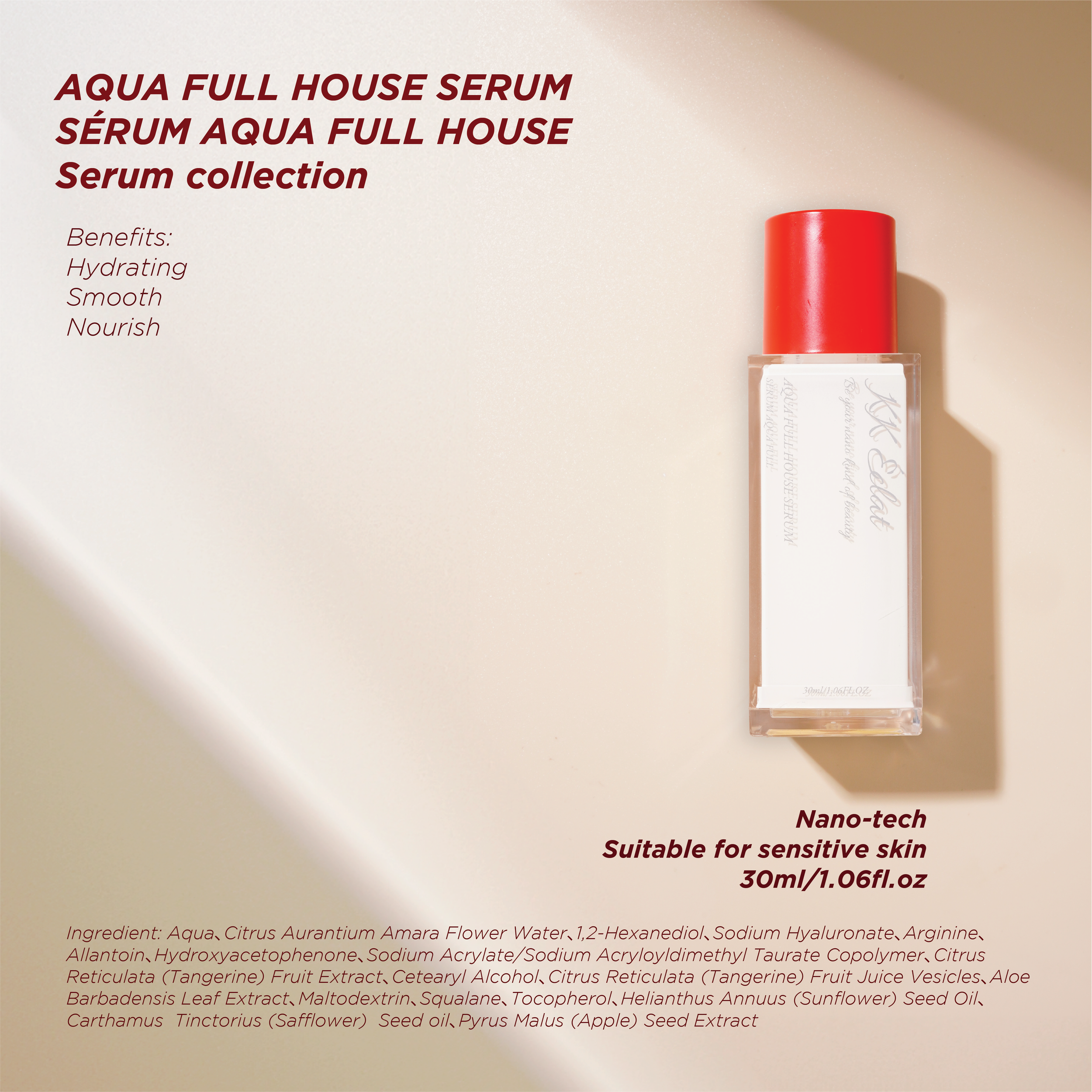
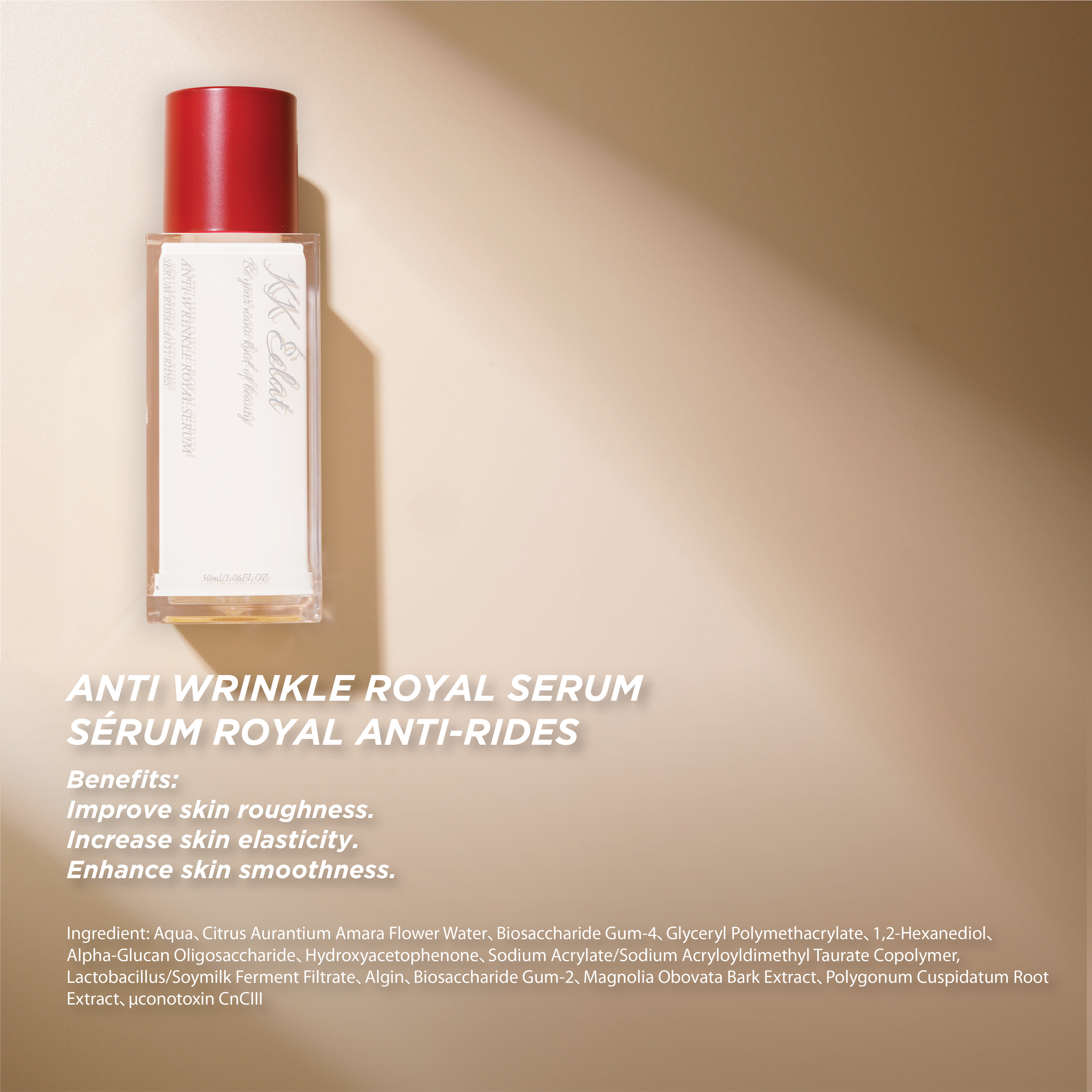
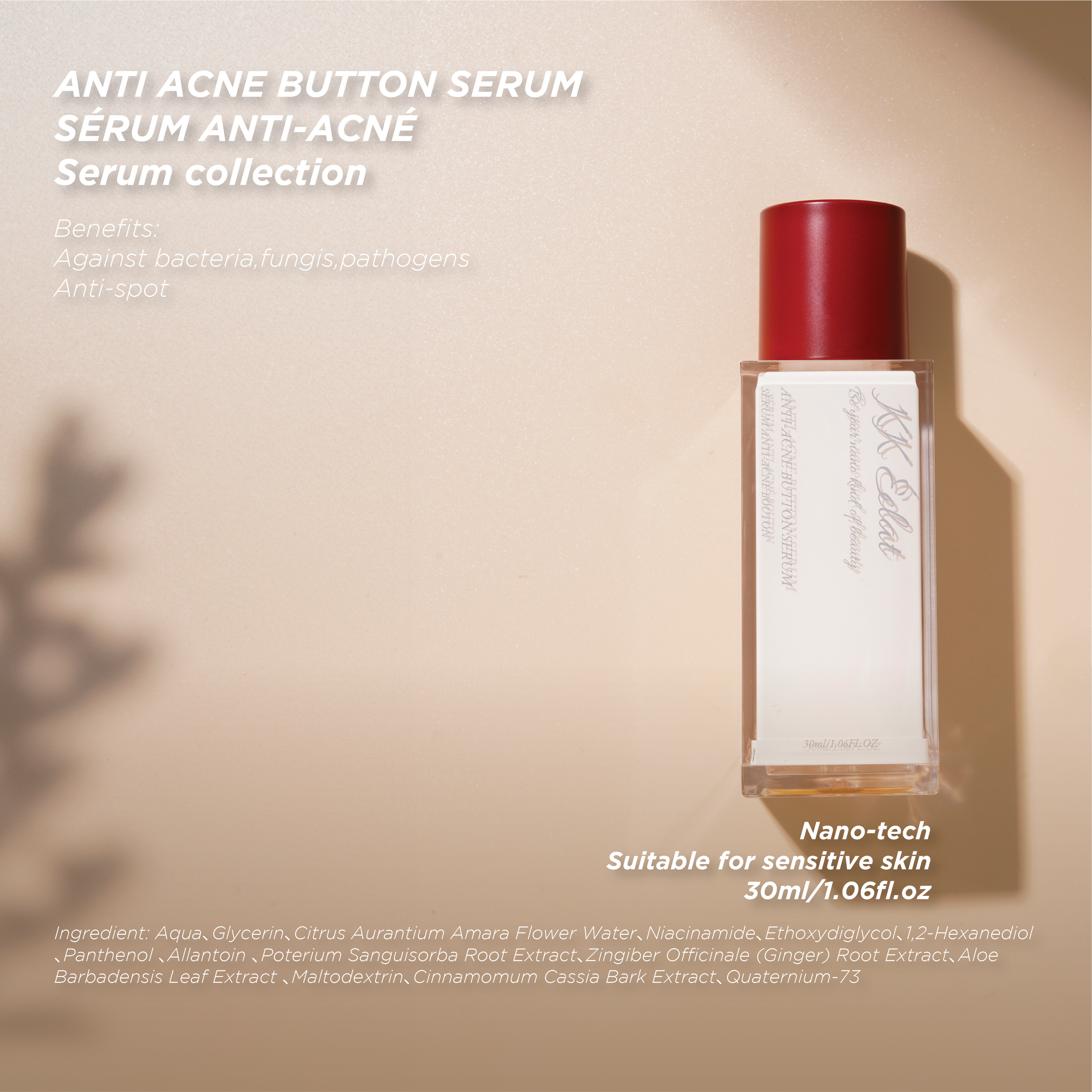
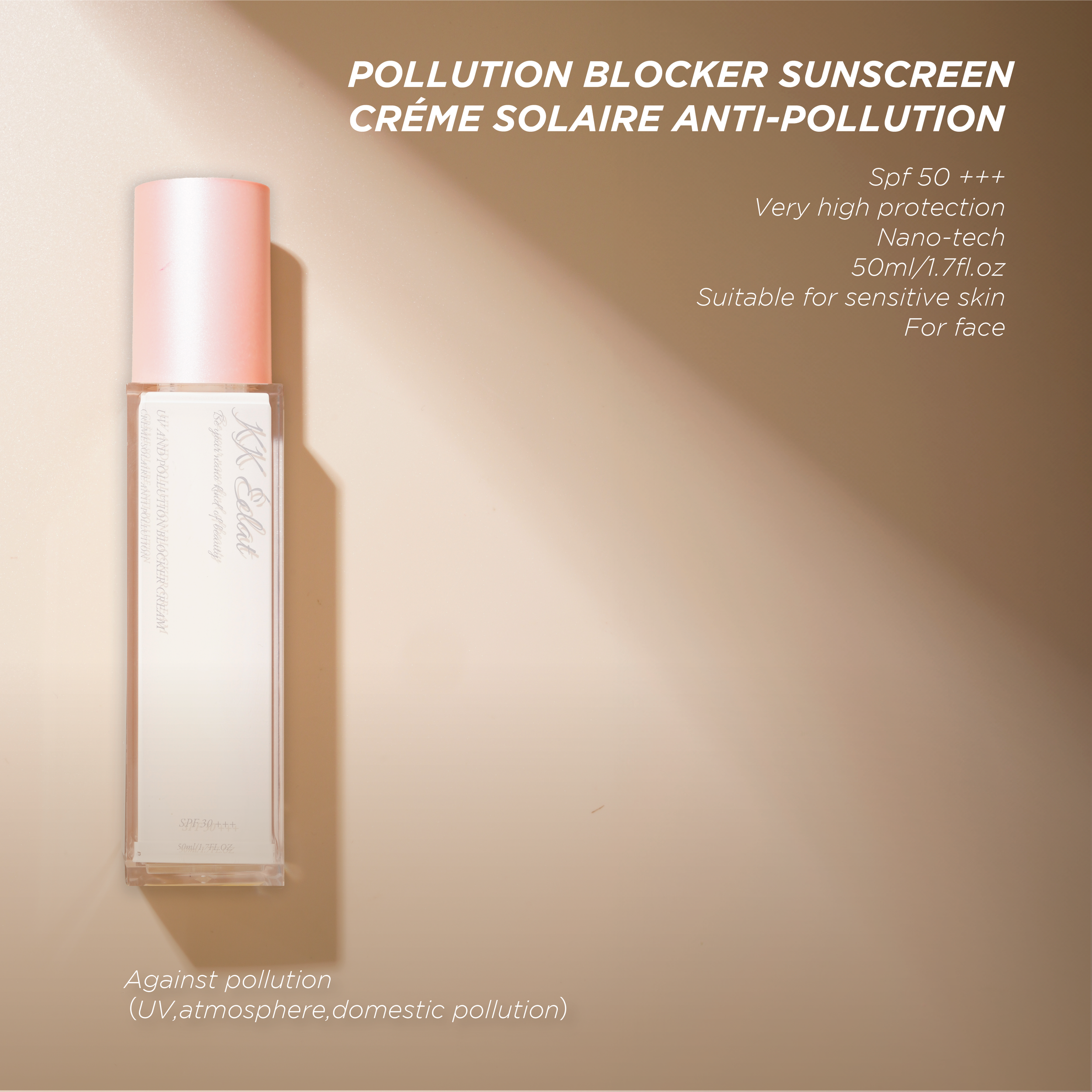
PRODUCT • SHOTS •
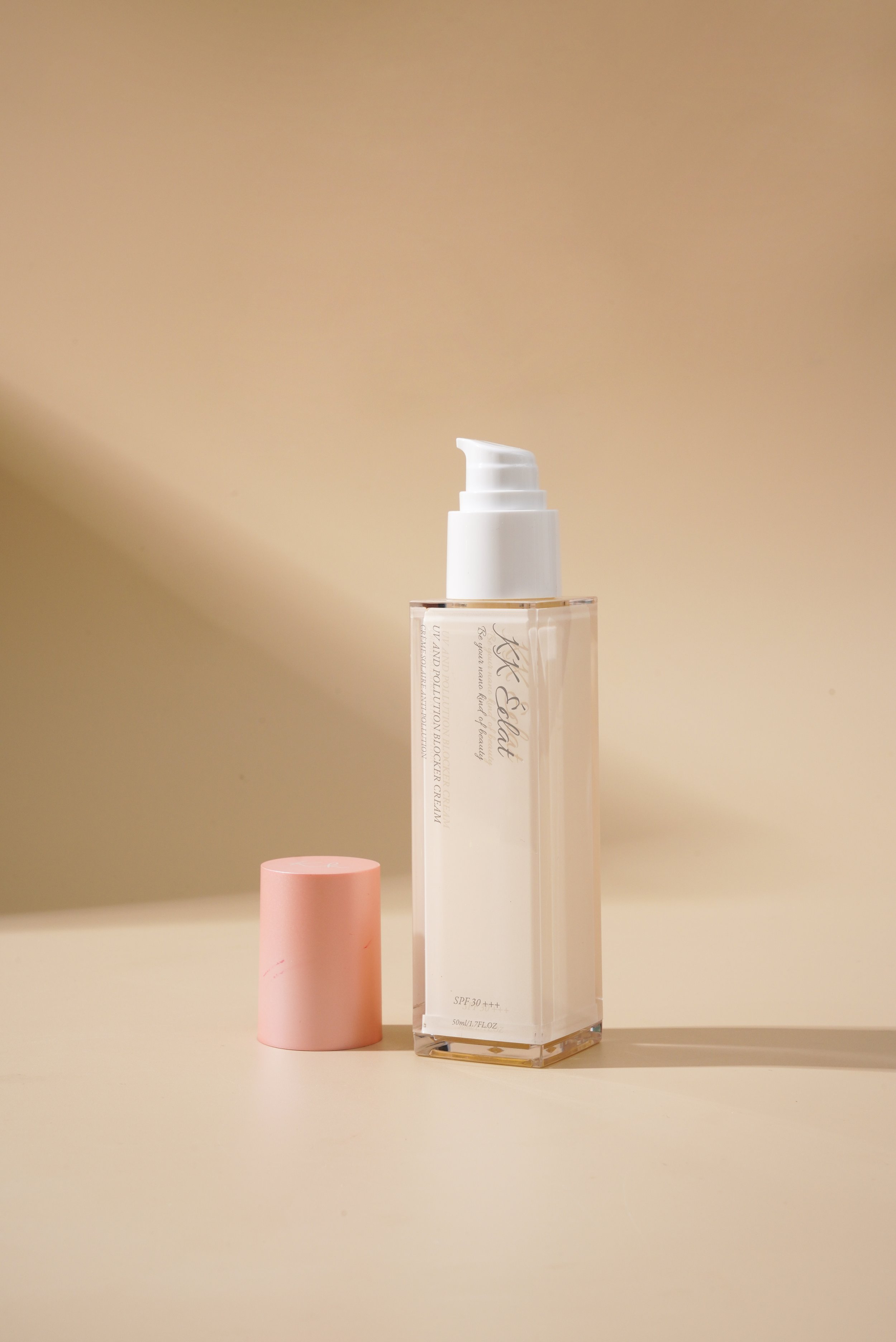
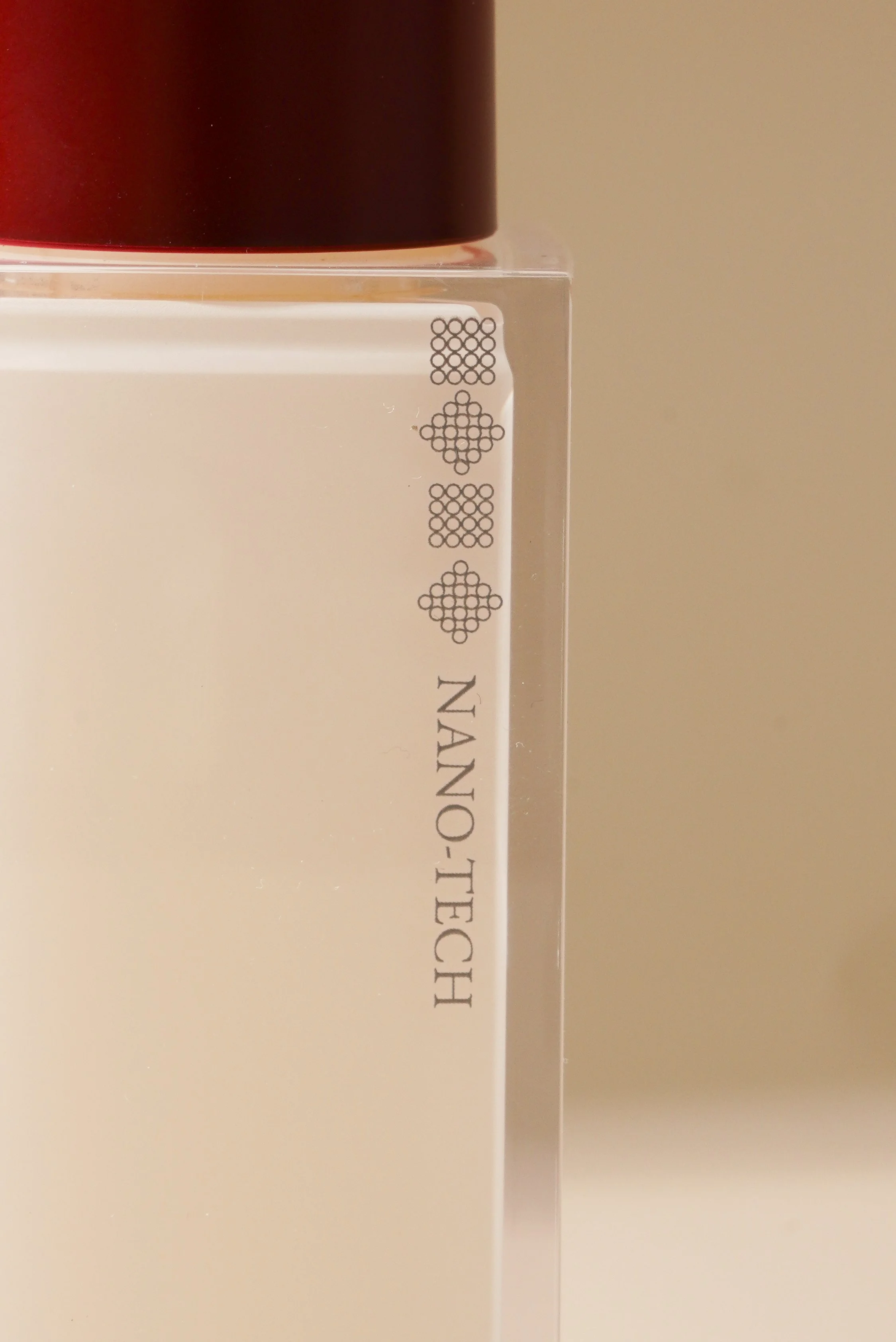
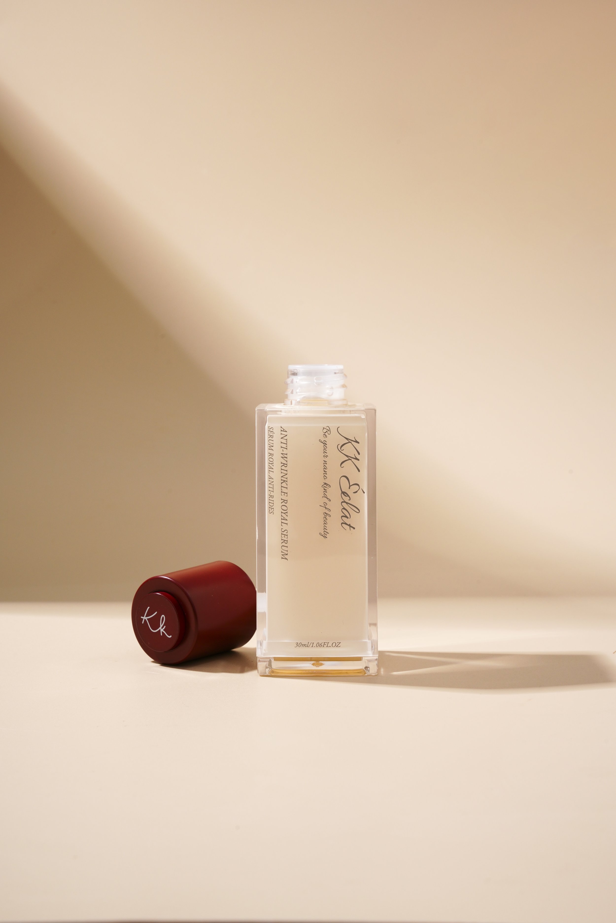
PRODUCT
•
BROCHURE
•
PRODUCT • BROCHURE •
